There’s a quip I’ve seen recently posted on UX LinkedIn groups, ‘A user interface is like a joke. If you have to explain it, it’s not that good.’ Very true in some cases, but I don’t think this can be applied across the board.
This got me thinking about how introductory onboarding pages are used across websites and apps and how effective they really are. Onboarding pages are used to introduce a website to a visitor and help them to guide them on their first journey through it.
In many cases, it’s like opening a brand new camera. You just want to go ahead and use it, you don’t want to have to read through the instructions first.
However, onboarding doesn’t just need to be instructions on how to use the site. There are some companies using introductory pages in great ways that encourage users to immediately interact with their site and take action.
Here are some good examples of onboarding, getting users excited about what you can offer them.
Get them clicking
Use engaging calls to action, engaging interactions and infographic content to get users started on their journey to understand your USPs.
Wealthboard do this well.


Give users a taste of what they can get by signing up
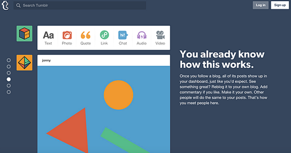
Tumblr do this nicely, using a sleek stacked design to simplify and explain the features one by one. Their use of language is encouraging, making potential users feel like it’s so easy to use that it needs no real explanation. Clear calls to action are provided on each page, persuading the user at each step to sign up.


Keep it simple and visual
On download of the app, Google translate give users the clear option to dismiss the tour or take it. The tour slides are kept very visual, making information easy to sink in before getting started.


Just keep is simple.

