I was in a meeting the other day and someone was talking about their website homepage and how good the rotating carousel was at showcasing the range of services they offered.
This got me thinking, when was the last time I had actually paid real attention to a carousel image or clicked on one for that matter? I couldn’t remember. So I asked the question in the meeting. And it was of no surprise that not one person there could actually remember interacting with a carousel either.
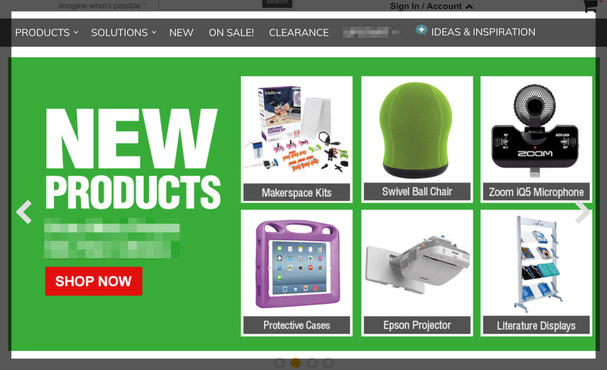
Thinking about a recent usability testing project, one of the objectives was to look at the most effective ways of promoting a new offer, which was very prominently positioned within a rotating carousel. How many of the eighteen test subjects clicked through to explore the offer through the carousel? Yep, none.
Nielsen Norman Group report a study in the UK where users failed to complete what should be a simple task because of a rotating carousel. The rotation just looks like advertising and so content is overlooked. This could be closely related to banner blindness, which we see time and time again.
Poorly coded carousels can also cause accessibility issues – another reason to think more carefully about homepage and landing page designs.
If rotating carousels have the potential to be either ineffective or cause barriers to use, how best to utilise key landing page space? After all, their key appeal is to surface lots of content hopefully matching up to the needs of visitors – as well as satisfying internal stakeholders who are all vying for space on the homepage!
Some other ways to effectively do this include;
Being selective and providing a single banner image that remains in place throughout can promote a key message or proposition successfully. Dropbox for Business does this through a bold strapline and very clear call to action.

Emirates Airlines has an image of their highly recognisable cabin crew and a series of quick links to key tasks.

Alternatively, using a panel style layout – either with one panel taking precedence or all of equal size, providing the opportunity to showcase a range of options. Edinburgh branding company The Touch Agency do this well.

The Kex Hostel in Reykjavik presents their content in a boxed pattern, with a static banner image to boot!

In a grid pattern like these examples, panels of the same size give equal weight to each option, while differing sizes allow you to prioritise what is presented to visitors. Both have their merits.
There is growing a growing bank of evidence that rotating website carousels are an ineffective way of displaying content. If you must implement a carousel of images, please don’t auto-rotate them. It doesn’t work, will annoy your visitors and only serves to meet internal needs without giving real consideration to the needs of your end users.
