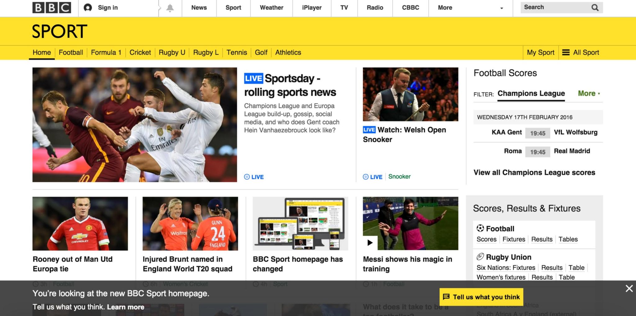
The BBC released a new version of the Sport section of their website. This is part of a wider project to provide a more consistent experience, whatever device is used to access the content.
[…]
As an 80’s child working in UX, I work with websites day in and day out, listen to clients needs, observe and interact with end users, work out solutions, sketch them out, communicate ideas & suggestions and constantly look at new research and explore trends.
[…]
I was in a meeting the other day and someone was talking about their website homepage and how good the rotating carousel was at showcasing the range of services they offered.
[…]
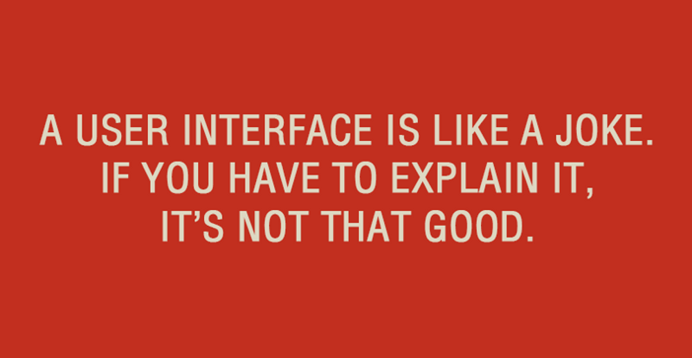
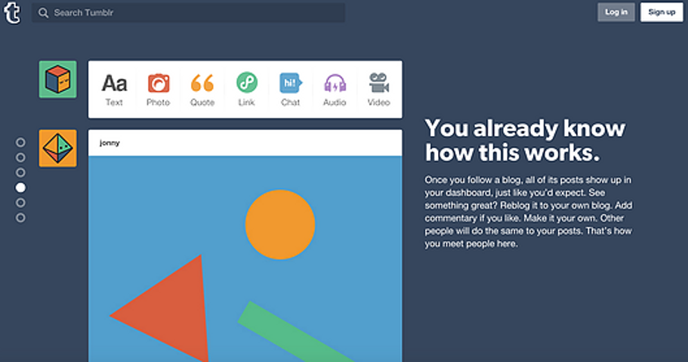
There’s a quip I’ve seen recently posted on UX LinkedIn groups, ‘A user interface is like a joke. If you have to explain it, it’s not that good.’ Very true in some cases, but I don’t think this can be applied across the board.
[…]
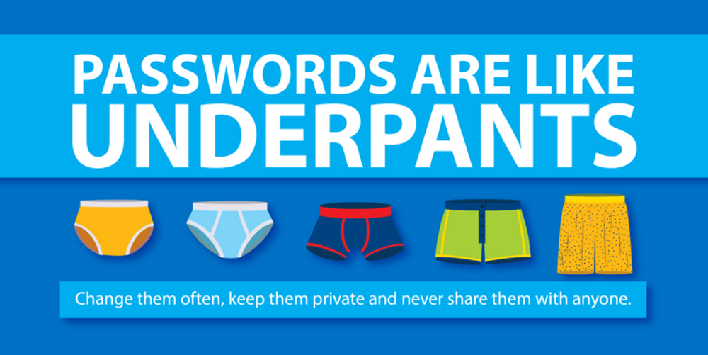
Passwords are a good thing, right? It’s pretty much a given. But to be useful they need to be memorable. Or they’ll be soon forgotten or worse still, written down – defeating the point entirely. […]
I’ve lost count of the number of times I’ve heard this. Usually from someone who isn’t a UX expert. Let’s put it to bed. It just isn’t true. And if it is true on your website, then there’s a good chance it is a consequence of your design or content rather than an inherent failing on the part of your visitors.
[…]

